
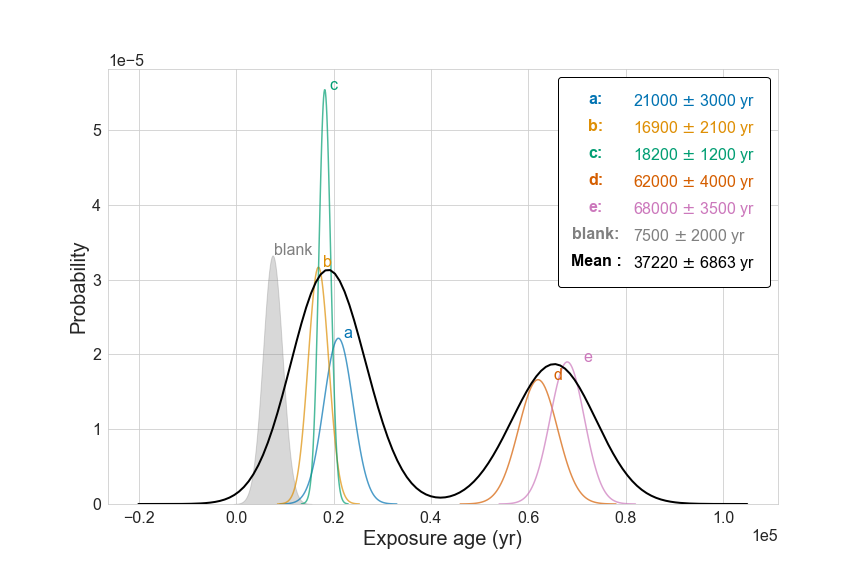
How to draw camel plot to visualize exposure age using Python
If you want to download and start using the code immediately, the code can be found at Github.
What is a camel plot
The term camel plot (or camel diagram) is a way to visualize the Gaussian uncertainty of some measurements. The term is first coined by Greg Balco in one of his blog posts.
What is it good for
The diagram is widely used in paleo-environment research. To estimate when a certain environmental event occurred, researchers collect environmental proxies that are presumably associated with the event, extract the amount of certain chemicals from the proxy, and use that amount to determine at which time certain environmental events took place.
For example, some scientists are interested in the extent of glaciation during the Last Glacial Maximum to see how much glacier has been lost. They found some boulders in the glacier valley, and hypothesized that these boulders used to be buried underneath the glacier until exposed when the glacier melted due to increased temperature. The way to find out whether the hypothesis is true, is to measure the amount of a certain chemical called 10Be. Such chemical can only be created when the boulder is exposed to the cosmic rays (basically the sun). However, like every measurement in doing physical science, this amount of chemical goes with some uncertainty. The uncertainty roughly follows the Gaussian distribution. When taking multiple samples into consideration, the uncertainties associated with different samples needs to be propagated and there goes our camel plot.
How to make the plot
To create the camel plot, two parameters are necessary, the mean ($\mu$) and the standard error ($\sigma$). We generate some pseudo data that fits the criteria, and plot these pseudo data using a line.
In python, the data can be simulated using the scipy.stats module, and the plotting is done using matplotlib and seaborn.
The workflow
Import necessary libraries
import pandas as pd
import matplotlib.pyplot as plt
from matplotlib.legend_handler import HandlerBase
from matplotlib.text import Text
import seaborn as sns
import numpy as np
import scipy.stats as stats
Create a handle for the legends
One neat feature of the camel plot is that I customized the legend handle so that the legend not only tells us the color, but also the $\mu$ and $\sigma$ of each sample.
What it looks like:
class TextHandler(HandlerBase):
    def create_artists(self, legend,tup ,xdescent, ydescent, width, height, fontsize,trans):
        tx = Text(width/2.,height/2,tup[0], fontsize=fontsize, ha="center", va="center", color=tup[1], fontweight="bold")
        return [tx]
Create pseudo data and plotting them
Like I mentioned, this method needs to create pseudo data. The simulation of pseudo data can be easily achieved using the Probability Density Function of normal distributions. However, we want to cache all the simulated data for each sample, and the final camel plot will be created using all the data. We also want to create separate lists for the handles and labels, so that the legend can be customized.
handles = []
labels = []
data_cache = []

for i, row in df.iterrows():
    mu, sigma, group = row['age'], row['uncertainty'], row['group']
    x = np.linspace(mu - 4*sigma, mu + 4*sigma, 100)
    data = stats.norm.pdf(x, mu, sigma)

    if group == 'blank':
        ax = ax.fill_between(x, stats.norm.pdf(x, mu, sigma)/num_samples, color='gray', label=group, alpha=0.3, zorder=1)
        color = ax.get_facecolor()[0] #fetch color of fill
    else:
        ax = sns.lineplot(x, stats.norm.pdf(x, mu, sigma)/num_samples, label=group, alpha=0.7, ax=ax, zorder=2)
        color = ax.get_lines()[-1].get_c() #fetch color of line
        #collect the pseudo data to be used for production of overall curve
        pseudo_data = stats.norm.rvs(size=len(x), loc=mu, scale=sigma)
        data_cache.append(pseudo_data)
Create the customized legend
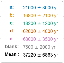
handles.append(("Mean :", 'black'))
labels.append("{0:.0f} $\pm$ {1:.0f} yr".format(mu_all, sigma_all))
leg = ax.legend(handles=handles, labels=labels, handler_map={tuple : TextHandler()},
                    facecolor='white', edgecolor='black', borderpad=0.9, framealpha=1,
                    fontsize=16, handlelength=3)
for h, t in zip(leg.legendHandles, leg.get_texts()):
    t.set_color(h.get_color())
A last few touches to modify the axis, labels, and ticklabels:
ax.set_ylim(bottom=0)
ax.set_ylabel('Probability', fontsize=20)
ax.set_xlabel('Exposure age (yr)', fontsize=20)
ax.ticklabel_format(axis='both', scilimits=axis_sci_limits)
ax.yaxis.get_offset_text().set_fontsize(16)
ax.xaxis.get_offset_text().set_fontsize(16)
ax.tick_params(labelsize=16)
The final product


Leave a comment